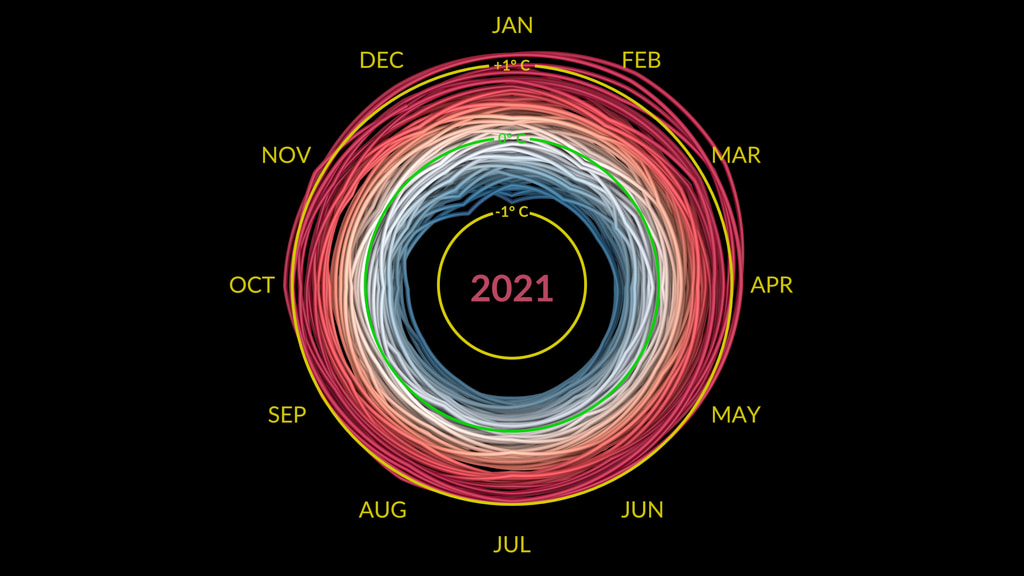
Not exactly breaking news about climate change, but unquestionably a neat way to visualise recent temperature changes:
The visualization presents monthly global temperature anomalies between the years 1880-2021. These temperatures are based on the GISS Surface Temperature Analysis (GISTEMP v4), an estimate of global surface temperature change. Anomalies are defined relative to a base period of 1951-1980.
To my mind, the only issue is that it's only at the end of the visualisation that the vantage point shifts to make crystal clear the extent to which the trend has been heading in only one direction for the last 40 years, and only getting worse over the last 20 years.
Much lip service to the cause of action to prevent climate change, little visible progress in the right direction.
[Via jwz]
